Collateral Management
To comply with a non-disclosure agreement, I have omitted the confidential information in this case study including the branding and colors. All information in this case study is my own and does not necessarily reflect the views of BNY Mellon.
Overview
In 2015, BNY Mellon introduced NEXEN, a financial services platform that provides users access to BNY Mellon services across multiple financial services segments. The organizational goal was to onboard multiple applications to the platform over the next few years. I was provided with an opportunity to redesign and onboard the Collateral portal to NEXEN.
My Contribution
-
Heuristic Evaluation
-
Prototyping
-
Usability Testing
-
UI Design
Team
-
Product Owner
-
Business Analyst
-
Software Developers (2)
-
QA Analyst
-
Visual Designer
-
UX Designer (2)
Timeline
Sept' 2016 - Jan' 2017
Tools
-
Axure RP
-
Balsamiq
The Challenge
Collateral Portal evolved with numerous iterations with the functionalities and customization due to changes in technology advancements and growing business requirements. Though efforts were made to incorporate changes scalability, consistency, and changing user needs went for a toss. As a result, the software became complex to use, costly to support and nowhere near modern web standards. In 2016, an effort was made by the UX team to redesign the application.
Goals
-
Provide an interface that is scalable, responsive and aligned to BNY Mellon's design library.
-
Save user's time and BNY Mellon's technology efforts by eliminating or replacing needless features.
Process
Understand business requirements and existing application

Understand user, define needs and pain points

Brainstorming

Wireframing & Prototyping

Testing the designs with users

Implementing the final design
Empathy
We followed the Design Thinking process where the first phase was to empathize with the users. It was also important to get the context and understand terms like Collateral, Saegregation, Segregated Accounts, etc. Business Analysts and secondary research helped me a lot in understanding the business better.
Research Methods
.png)
Contextual Inquiry, semi-structured interviews were conducted with 3 Client Service Analysts. Senior designer moderated these sessions.
.png)
Heuristic Evaluation was conducted by me to understand the usability violations in the existing application.
Research Findings
-
Usability Issues: There were a lot of usability issues — like navigation, layout, and even the typography. Users were so busy performing their tasks that it became routine for them to use this application the way it is and as a result, they did not even notice these issues anymore.
-
Time-Consuming Process: The average time taken to create a pledge or receive was around 17 mins. It was observed that users were spending a lot of time to complete the process because of the cumbersome UI.
-
Modern Design: The application interface was never in line with modern web standards. It was important to redesign the interface by following the organization’s UI standards.
Define
At this stage, the other designer (Senior) moved to some other project and I got the opportunity to lead the project.
It was important to know the user and business goals before moving further. I continued the process by defining high-level user and business goals. The Agile method was best suited for such a massive time-bound project. As I concluded our research, I jotted down the user stories as well. They were then defined and refined in collaboration with the product owner. I identified three key stakeholders: Collateral Provider, Collateral Receiver, and Client Service Analyst.
User Goal
To move the asset quickly and easily from one account to another.
Business Goal
Secure and Transparent asset movement with better system performance.
User Stories Format
As a [user/persona], I would like to [low-level task], so that [high-level goal]. For example, As a Client Service Analyst, I would like to move assets from a Custody Account to a Segregated Account, so that I can create a pledge.
Problems to be solved
-
A user navigating to multiple screens to create a pledge/receive wastes a lot of their time.
-
Less control over the submission. Higher chances of submitting a pledge/receive because the system never asks for confirmation.
-
Lack of filter options.
-
No option to sort the table.
-
Layout structure, especially the Overview screen. There was a lot of information for users to digest which led to cognitive load.
-
Some of the data visualizations on the existing application were noticed to be not in line with the company standards and hard to understand.
Success Metrics
-
100% consistent UI by leveraging the components and patterns defined in the BNY Mellon Design System.
-
Reduce the average time spent on creating Pledge/Receive by 40%.
Ideate
During this phase, a lot of brainstorming sessions happened within the team. I came up with some paper prototypes first and discussed the same with the product owner. I also made a few assumptions when required, which were later validated with business stakeholders.
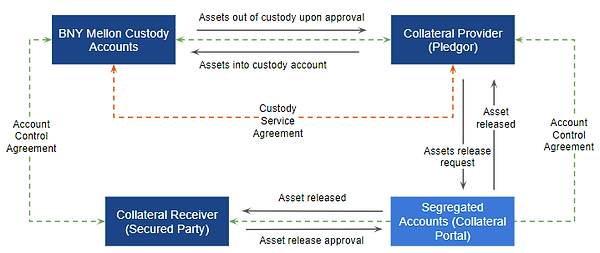
Business Process
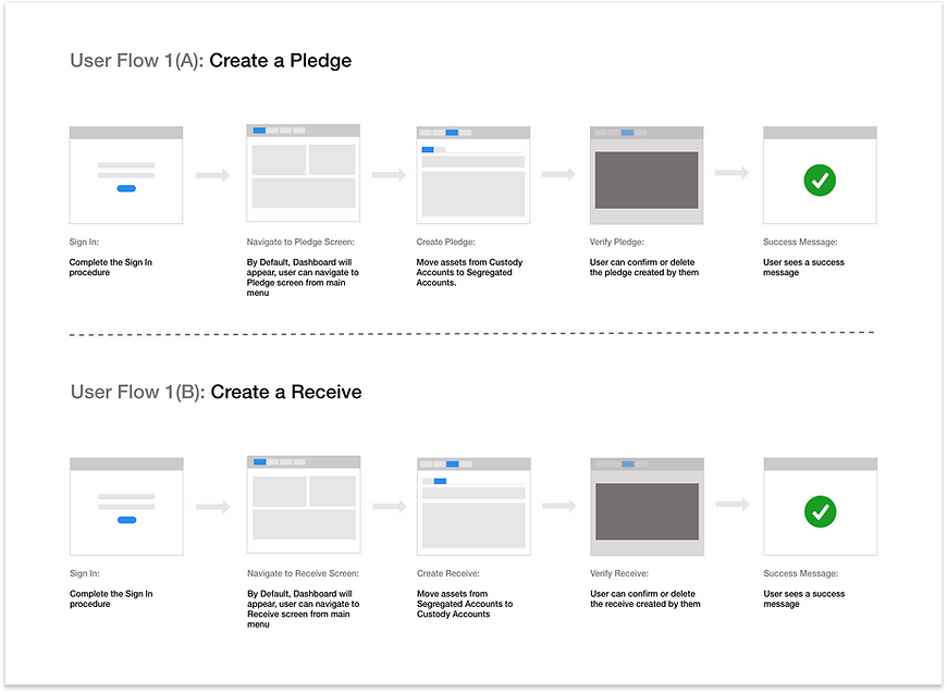
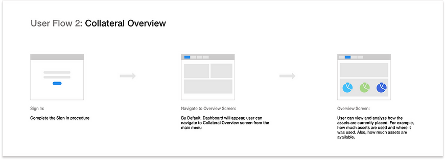
Prototype
I used Balsamiq and Axure RP to transform ideas into the design. These designs were tested with users to get continuous feedback. Also, I worked collaboratively with a Visual Designer to deliver the final product. Prototype Link
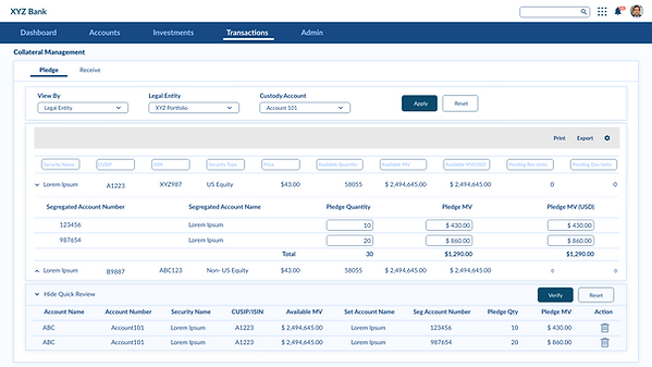
Pledge Screen
The page hosts an interactive grid listing securities (based on account) under the selected Legal Entity. This grid allows users to scan, analyze, compare, filter, sort, and manipulate information to derive insights and perform necessary actions. The interface allows users to move the assets from a Custody Account to a Segregated Account and hence initiate a pledge.
Receive Screen
The page hosts an interactive grid listing securities (based on Segregated accounts) under the selected the Legal Entity. This grid allows users to scan, analyze, compare, filter, sort, and manipulate information to derive insights and perform necessary actions. The main purpose of the user coming to this screen is to move the asset from Segregated Account to Custody Account and hence initiate a receive.
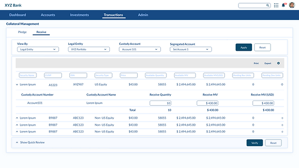
Key Changes on Pledge and Receive Screens
-
Easy to use and better filter options.
-
An interactive grid allows the user to have more controls like export, sort, etc.
-
No need to go to multiple screens. The expandable grid allows the user to perform the task while they are on the same page.
-
Displaying total quantity and market values (MV) which added value by eliminating the step of going to another tool for calculations.

New Feature: Quick Review Panel
On both Pledge and Receive screens I introduced a quick review feature. An accordion is used, which is expandable and collapsible. So having everything on the page meant there would be a lot of scrolls and so to avoid scrolling up and down, I came up with the idea of quick review section that allows the user to see what has been done so far. Also, they can delete any record from here without looking for the record in the grid. This feature was received well by the users and stakeholders.
Verify Pledge and Receive
The purpose of this screen was to allow the user to verify the transaction before the final submission. In case the user is not satisfied with the entries, they can either delete each entry or can go the verification process. The main purpose of this screen is to avoid any mistakes and help the user read all the entries before the final submission.
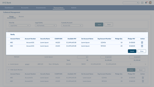
New Feature: Alert Messages
Earlier interface was violating the visibility of system status heuristic. So we came up with this confirmation box (in green) which was in line with the organization's design system.

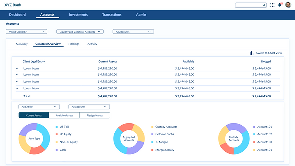
Collateral Overview Screen
The purpose of this screen was to allow the user to see where and how their assets are placed currently. How many assets are pledged or how much assets are available, all these questions were answered here. Data visualizations help the user to view complex data in an easier way. Highcharts was used by developers during the implementation.
Key Changes on Collateral Overview Screen
-
A well structured layout made it easier to find the relevant information.
-
Easy to analyze data.
-
Better options to filter the results.
Information Architecture
I collaborated with the taxonomy team and after a couple of sessions with the taxonomy and business team, we went to structure the information architecture.
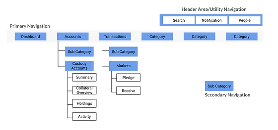
Information Architecture
Deliver
After nearly 4 months of effort, the MVP was launched in Jan 2017. I received a great response from the stakeholders. I was in touch with the developers/QA Analysts even after the designs were delivered to them to make sure the final interface is aligned with the company's Design System.
Impact
-
Moreover, the average time spent per user on creating a pledge or receive was reduced by 29% (from 17 mins to 12 mins).
-
Minimized the cognitive load by eliminating needless features and organizing the information in a more structured way than before.
-
The UI was consistent with the BNY Mellon design standards.
-
BNY Mellon Q3 reports in 2017 say “ Asset servicing fees increased 4% year-over-year and 2% sequentially. The year-over-year increase primarily reflects higher equity market values and net new business, including growth in collateral management”. This means that there was a total of 20 million US dollars increase (quarterly) in revenue under asset servicing and collateral management had a role to play in it.
Learnings
-
Learned how to operate in the Agile setup and produce better outcomes.
-
No matter how the team dynamics change during a project, the work should continue.
-
Taking ownership.
-
Learned to make the best use of a design system.
-
Learned to integrate business, technology, and time constraints in my design.
Additional Infromation
There are a few points that were not covered in this case study. Those are mentioned below and can be discussed in person.
-
User Testing
-
Front end development
