Reimagine the thermostat pairing process
Overview
When I joined Mysa in July 2019, I partnered with the product and marketing teams to analyze the user feedback from the pre-launch of Mysa's In-floor smart thermostat. We discovered that the users were not satisfied with the thermostat pairing process. That led to my first project - reimagining the pairing process.
My Contribution
-
UX Research
-
Storyboarding
-
Prototyping
-
Usability Testing
-
UX Writing
Team
-
Product Manager
-
Full Stack Developer
-
Front End Developer
-
Graphic Designer
-
UX Designer (myself)
Timeline
6 weeks
Tools
Adobe XD
Defining the Problem
From pre-launch testing, we learned that users were making multiple attempts to pair the smart thermostat with Mysa's mobile app, which led to users leaving the app in frustration without pairing the device, and a few sent emails to the support team for help.
How might we help users pair a smart thermostat with the Mysa app quickly and accurately so that they can start controlling their thermostats with the app?
Process
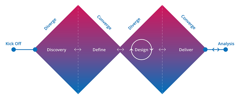
UX Process at Mysa
Project kick off
During Kick-off, the whole team came together to discuss the goals, success metrics, and timelines for this initiative. By end of this phase, the team had a better understanding of:
-
Why are we doing it?
-
Who is it for?
-
What does success look like for this project?
Discovery
To better understand how the users pair the thermostat with the Mysa app, I led generative research with 12 Participants (6 iOS and 6 Android). Thanks to the hardware team at Mysa for installing the thermostat and allowing me to use their lab for this study.
Key Findings
-
7 out of 12 participants struggled to pair the thermostat in the first attempt.
-
On average, participants spent over 5 minutes to pair the thermostat.
-
Most Android users failed to pair the thermostat using Near Field Communication (NFC) technology.
-
iOS users got confused when redirected to Apple's HomeKit app to continue the thermostat pairing process.
-
Many Participants found the pairing instructions on the mobile app unclear and confusing.
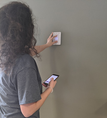
Participant attempting to pair the thermostat
Define
The team regrouped to discuss the key findings from the discovery phase. We considered all the software and hardware limitations that were stopping the users from achieving their goals.
User Goals
-
Pair the thermostat easily without having to leave the app.
-
Ease to consume content and visuals.
-
Control and clarity on the pairing process irrespective of the operation system.
Success Metrics
-
At least 80% to pair the device on the first attempt.
-
Reduce the average time spent to pair the thermostat by 10%.
Technology Contraints
-
iOS users need to be re-directed to Apple's HomeKit app.
-
Android phones don't have a standard NFC chip location.
Design
Considering the user goals, business value proposition, and technology constraints, I identified design updates required for the app. I used Adobe XD to create wireframes and build high-fidelity prototypes. I led the initiative of defining animation guidelines (Thanks to this article).
Key design updates
-
Near Field Communication (NFC) pairing option deprioritized for Android users.
-
Updated the illustrations and content to provide clarity to users. (Illustrations were designed by the graphic designer)
-
For iOS users, introduced the pairing options page.
-
Added animations to provide in-the-moment support and better context to the users. (Co-led by graphic designer and myself)
#1 Near Field Communication (NFC) pairing option deprioritized for Android users.

Before
Near Field Communication (NFC) was the primary option for Android users to pair the thermostat. Many users failed to pair using this option because it was hard to find the location of the NFC chip on their phones.
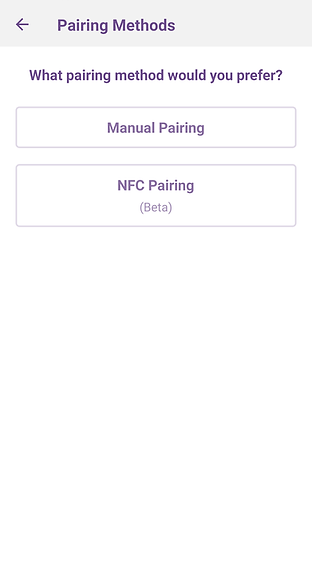
After
More control and freedom to users by allowing them to select the pairing option of their own choice. The manual pairing was a highly desired option. Hence, it's on top of the list. Moreover, NFC was moved to the beta.
#2 Updated the illustrations and content to provide clarity to users.
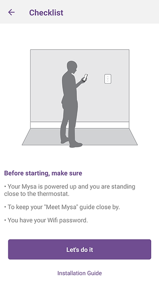
Before
-
Cluttered information, missing the prerequisites of the pairing process.
-
The illustration does not tell a story.
-
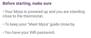
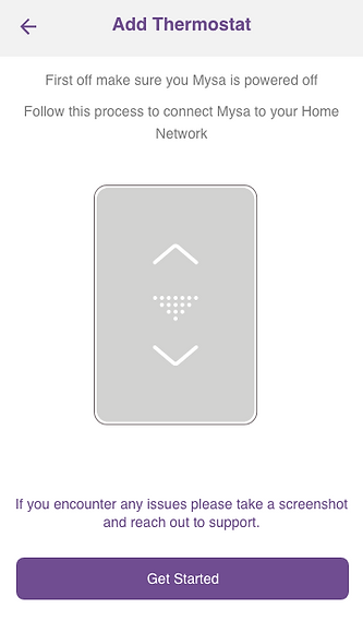
Introduced a meaningful illustration to provide more context.
-
Added a precisely defined checklist to send a concise and clear message.
-
Easy access to the installation guide.
After
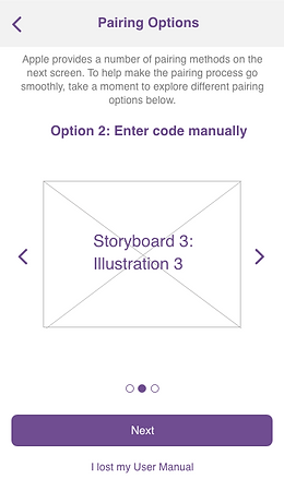
#3 - For iOS users, introduced the pairing options page.


New Screens
-
Explained different pairing options to provide more control and flexibility.
-
Added a way to recover in case the user manual is not available.
#4 Added animations to provide in-the-moment support and better context to the users.
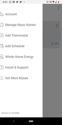
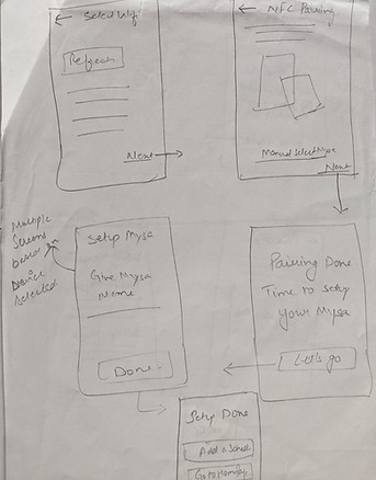
Behind the scenes - Paper Prototyping & Storyboard


Behind the scenes - Design Iterations
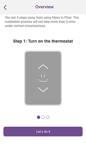
Iteration 1
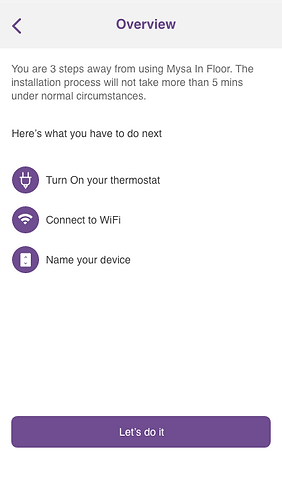
Iteration 2

Final Design
Usability Testing
I tested the prototype with 11 users and learned that the updated design performed better. The metrics used to analyze were the average time and number of attempts to pair the thermostat.
Key Findings
-
Reduced the average time to pair by ~2 minutes.
-
9 out of 11 participants paired the thermostat in the first attempt.
-
All the participants found the animations and illustrations very helpful.
-
Some iOS users were unconvinced by Apple's mandatory step to go through HomeKit. The dev team decided to work on this concern for the next release.
Develop
I worked closely with two developers to implement all the changes smoothly. I leveraged the Adobe XD development sharing feature to hand off the designs to the developers. The perk of being in a start-up was that I was sitting next to developers and could quickly share the designs to check technical feasibility.
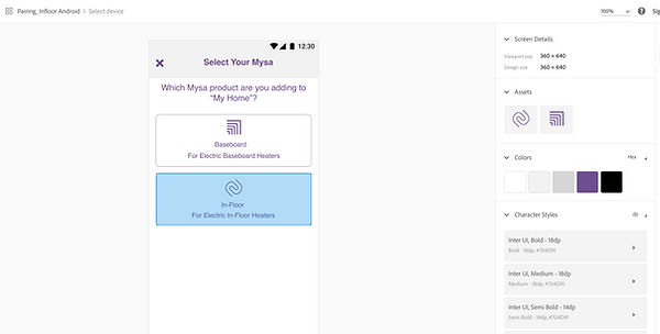
Adobe XD Development Link
Impact
-
Saved a lot of time for our users and reduced the complaints received by the customer service team.
-
After the launch, many users found the animations and illustrations helpful. It led to better ratings on app stores.
-
Defined a UX process for Mysa that helped us continually launch and improve the products.
Learnings
-
Embrace uncertainty.
-
UX Writing is a vital part of the overall user experience.
-
Big Lesson! Don't hand over animations in gif format to the developers. Instead, use the JSON format for development since it improves the app's performance.
-
It's okay to make mistakes. However, don't repeat them. Take full accountability for your work and have a rationale to back your decisions.
-
Better design handoff means fewer questions from the developers and faster development.

